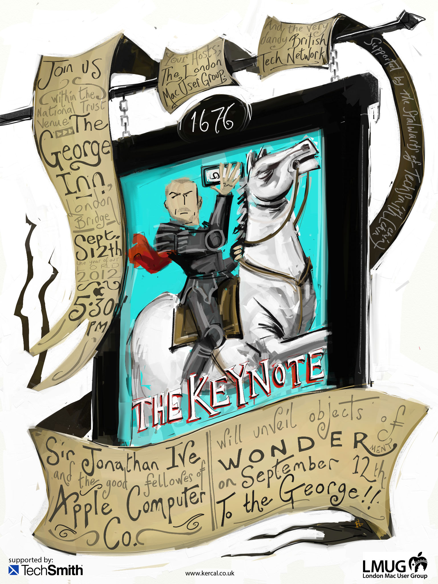
The London Mac User Group Sept 12 meeting poster...
Categories: artwork, general-stuff
Tags: Apple fanboy, iPad artwork, LMUG, ArtRage, Apple keynote
Date: 02 September 2012 15:31:57
I'm very fond of the chaps and chapettes of the London Mac User Group (and also of the British Tech Network as there is a lot of overlap). A fab bunch of people; friendly, jovial and knowledgable across a range of disciplines and skillsets. I'm always happy to meet up with them if time allows (and even happier if the time allows me to get to the very wonderful Chin Chin Labs prior to getting to an LMUG meeting... Hence there being a smidge of Chin Chin on the final poster, also a fond hallo to the marvellous Mr Will Green who has been known to say the Ch word once and then twice on his fantastic British Mac podcast).
My favourite sessions are the ones where we've all come together to celebrate the keynote sessions, everyone hanging off the words displayed on projectors and discussing whether our credit cards are prepped and ready. For the past two keynotes I've been asked to provide posters for the events and time has been on my side so I was happy to say yes. This time I was asked again and time wasn't on my side.... So I said yes anyway and sleep was the casualty. You can see the first two posters, in animated process video form, here and here.
So, time being against me, I should have gone a little easy on what I was planning to do, yes? That would have been sensible.
No.
Well, yes, it would have been sensible but no, that's not what I did.
(click on the poster for a larger format one...)
http://www.youtube.com/watch?v=B8pTJnBeB38&feature=youtu.be
(process video. Click to watch the image drawn from initial sketch to final painting...)
A couple of reasons led me to do the above image. The first is that it's held in a National Trust held pub of historical significance, which is something that does pickle my organically grown onions. The pub, the George Inn, sounds fabulous and I'm looking forward to visiting (my fifth National Trust venue visit over the past 2 weeks since the family joined). (The other four places visited were not pubs, incidentally).
Another reason? Looking through pictures of the pub (while doing the research for what it is what I was going to do) led me to the pub sign and that was instantly what I intended to work my picture around...

Let's be honest, that's Tim Cook isn't it? Startling facial similarity... So I started to draw him in the poster I ended up withand then thought, as it's Olympic year (I can say that, right? No need for lawyers to get involved), I'd go for a bit of home field advantage. Because Sir Jony Ive is one of the most fabulous people this country has produced... Every time he speaks (sadly via pre-recorded video, why has he never taken to the stage I often wonder?*) during a keynote he has the most fabulous driven and passionate way of talking about what he and his team have come up with. I know that Apple is a team and that a huge number of people are responsible for its success as a company but none, to me, are as fascinating and important as Sir Jony.
Hence the poster. Painted on iPad 2 using the very powerful/extraordinary ArtRage app using my current go-to styli: Stylus Sock Pro and short hair Nomad Cobalt Compose paintbrush. I hope you like it as much as I enjoyed the making of it. As mentioned it contains a few things I love (keynotes, Jony Ive, Chin Chin, National Trust, bit of history, pint of beer and more) and I'm always happy to be painting things on a small slice of computer power and the apps that run on it.
Lastly, yes, I know that the company has not been called Apple Computer Co. for a while (and some might say detrimentally although it's a market decision and, with a retina Macbook on my one day wish list, it's not as if the computers are an afterthought or being phased out... I do think, sadly, we may have moved away from the days of each update of the computer delivering a beautiful case update as well - the iMac has reached a level of industrial perfection I can't imagine where it might go - and the Cube, lampstand and so on may likely never happen again... but the iPhone, iPod and iPad have all revolutionised the way I work so fair play to Apple for changing the world again and again and again and again). The Apple Computer Co. was added to the poster as a loving hint, as is much of the image, to the original Apple logo by Ronald Wayne which I frequently use in the logo classes of my A level graphics group.
If you'd like to join in the fun of it then the meeting will be in the George Inn, near London Bridge, on the 12th September. All welcome, I'm sure they'd say.
(*personally I blame Oasis for the lack of Sir Jony on stage and assume that the health and safety/risk assessment team at Apple assume the SJI will take to the stage drunk, stick two fingers up at attending journalists who have slighted him in the past and kick a demo stand over as he leaves the venue. To be fair there might be a number of reasons why he doesn't take to the stage, but a lack of knowledge or lack of fans or humble voiced delivery are not likely to be on the list).
Lastly, forgot to mention it but the image was painted in two 4 hour sessions on a Friday and Saturday night (having been asked to do the poster at 5pm on the Friday). Would have been longer but my brain has a habit of going offline around midnight/1am and I had a family birthday party throughout Saturday... See? I said time was against me on this one... :)
Also, lastly lastly, this may be one of the very few images of my own I end up using in the class. The reason is the left most scroll edges. Look closely and you'll see that they aren't on the video. It was a complete gut feeling thing that adding them would help the eyeflow on the piece and that is something that the A level class majors on. Basically, without the darkened scroll ends, the eyes of the viewer naturally gravitated to the top left text box, which is good as that was where I wanted the text to be read from. But almost as soon as I put the image to bed (well, emailed it to Steve and then put myself to bed) I was thinking 'must add a dark edge on the left hand side'. Not with any more thought process than that really, I just knew that it would work, and having done that I think it does. The viewers eye, balanced between the darker edges on the left and right hand sides of the image, now naturally gravitate on Sir Jony's eyes and then are lead to the text box which, I think, is the better eye flow for the whole piece. It's not the most detailed image I've created on iPad (probably the Marmite / Marmalot painting) nor the one I've spent longest on (that's probably still the Drew Struzan Up poster I did) but this poster makes me smile and, I think, works well for the time I had to complete it.


